Welcome to echarts4r, let’s explore the package
together.
- All functions of the
echarts4rpackage start withe_. - All its Shiny proxies end
with
_p. - All
echarts4rplots are initialised withe_charts. - All functions are
|>friendly. - Most functions have escape hatches ending in
_.
Video & Article
Thanks to Sharon Machlis there is an amazing video and article introducing echarts4r.
Your first plot
Let’s build a line chart, load the library and pipe your data to
e_charts. If you are not at ease with the
|> you can use e_charts(mtcars, wt).
# prepare data
df <- state.x77 |>
  as.data.frame() |>
  tibble::rownames_to_column("State")
library(echarts4r) # load echarts4r

df |>
  e_charts(x = State) |> # initialise and set x
  e_line(serie = Population) # add a line
If you are not at ease with bare column names you can use the escape
hatches ending in _.
The easiest way is to use the |> operator to add
plots and options.
Options
We could also change the lines to make them smooth.
df |>
  e_charts(State) |> # initialise and set x
  e_line(Population, smooth = TRUE) |>  # add a line
  e_area(Income, smooth = TRUE) # add area
Lets label the axes with the convenience function
e_axis_labels.
df |>
  e_charts(State) |> # initialise and set x
  e_line(Population, smooth = TRUE) |>  # add a line
  e_area(Income, smooth = TRUE) |>  # add area
  e_axis_labels(x = "State") # axis labels
We can use one of the 13 built-in themes, see ?e_theme
for a complete list, we’ll also add a title with
e_title.
df |>
  e_charts(State) |> # initialise and set x
  e_line(Population, smooth = TRUE) |>  # add a line
  e_area(Income, smooth = TRUE) |>  # add area
  e_axis_labels(x = "State") |> # axis labels
  e_title("US States", "Population & Income") |>  # Add title & subtitle
  e_theme("infographic") # theme
The legend and title are a bit close, let’s move the legend to another part the canvas.
df |>
  e_charts(State) |> # initialise and set x
  e_line(Population, smooth = TRUE) |>  # add a line
  e_area(Income, smooth = TRUE) |>  # add area
  e_axis_labels(x = "State") |> # axis labels
  e_title("US States", "Population & Income") |>  # Add title & subtitle
  e_theme("infographic") |>  # theme
  e_legend(right = 0) # move legend to the bottom
Add a tooltip, of which there are numerous options,
here we use trigger = "axis" to trigger the tooltip by the
axis rather than a single data point.
df |>
  e_charts(State) |> # initialise and set x
  e_line(Population, smooth = TRUE) |>  # add a line
  e_area(Income, smooth = TRUE) |>  # add area
  e_axis_labels(x = "State") |> # axis labels
  e_title("US States", "Population & Income") |>  # Add title & subtitle
  e_theme("infographic") |>  # theme
  e_legend(right = 0) |>  # move legend to the bottom
  e_tooltip(trigger = "axis") # tooltip
Finally, we are currently plotting population and income on the same axis, let’s put them each on their respective y axis by specifying an extra axis for Income.
Dual y axes is a terrible idea, it’s only here for demonstration purposes.
df |>
  e_charts(State) |> # initialise and set x
  e_line(Population, smooth = TRUE) |>  # add a line
  e_area(Income, smooth = TRUE, y_index = 1) |>  # add area
  e_axis_labels(x = "State") |> # axis labels
  e_title("US States", "Population & Income") |>  # Add title & subtitle
  e_theme("infographic") |>  # theme
  e_legend(right = 0) |>  # move legend to the bottom
  e_tooltip(trigger = "axis") # tooltip
Navigate options
echarts4r is highly customisable, there are too many
options to have them all hard-coded in the package but rest assured;
they are available, and can be passe to .... You will find
all these options in the official
documentation.
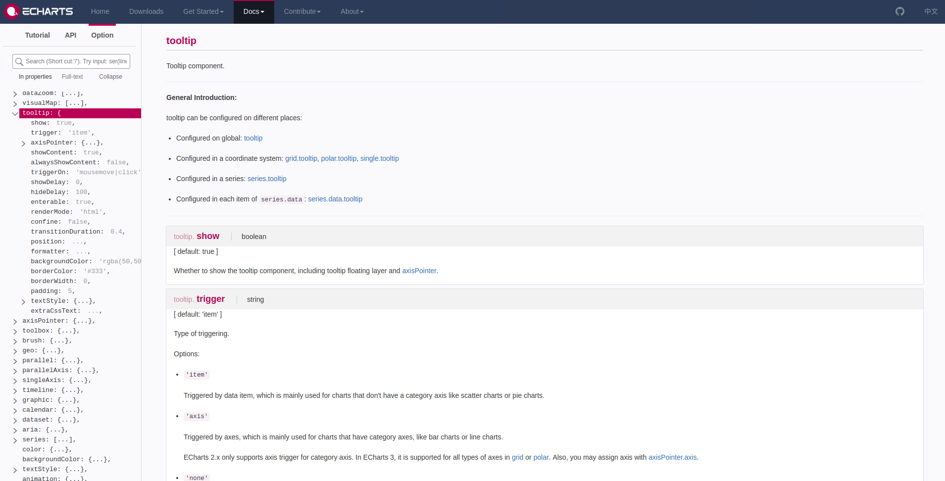
For instance the documentation for the tooltip looks like this:
Therefore if we want to change our tooltip to an axisPointer
we can do so by passing a list to axisPointer.
df |>
  e_charts(State) |> # initialise and set x
  e_line(Population, smooth = TRUE) |>  # add a line
  e_area(Income, smooth = TRUE) |>  # add area
  e_x_axis(name = "States") |>  # add x axis name
  e_title("US States", "Population & Income") |>  # Add title & subtitle
  e_theme("infographic") |>  # theme
  e_legend(right = 0) |> # move legend to the bottom
  e_tooltip(
    axisPointer = list(
      type = "cross"
    )
  )
Once you come to the realisation that JSON ~= list in R,
it’s pretty easy.
You’re in on the basics, go to the advanced section or navigate the site to discover how add multiple linked graphs, draw on globes, use the package in shiny, and more.